
Designing Peace of Mind for Pet Owners
A mobile app concept born from my own frustration tracking my dog's health. Through user research and testing, I discovered that the features that attract users aren't always the ones that keep them engaged.
Research: Understanding Pet Owners
I started by understanding the challenges pet owners actually face. Dog park conversations and digital surveys (11 responses) revealed three key problems:

Pet Owners Don't Understand Pet Nutrition
Brand claims like "premium" or "grain-free" mean nothing to most people. Pet owners want transparency but don't know how to evaluate what they're actually feeding their pets.

Multi-Owner Households Struggle with Coordination
Partners, roommates, and pet-sitters need to coordinate care but resort to primitive tracking methods that often fail.

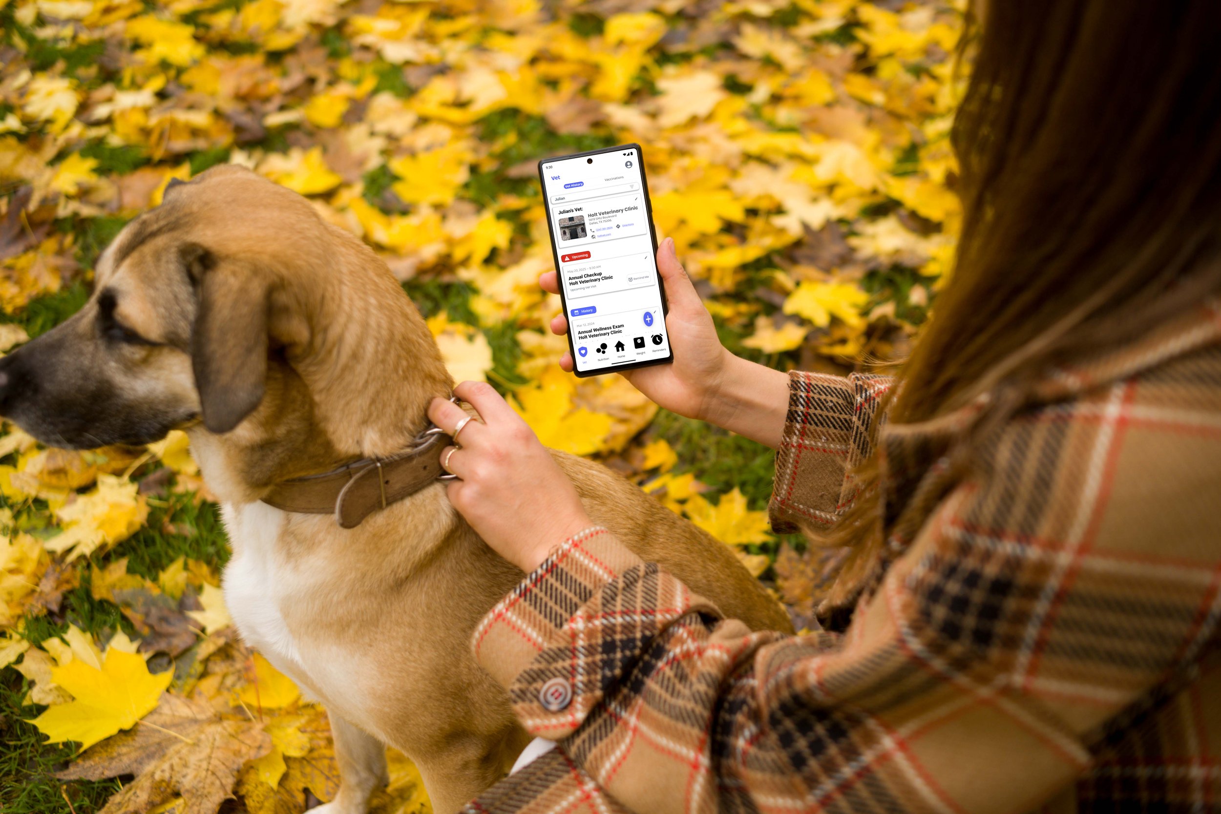
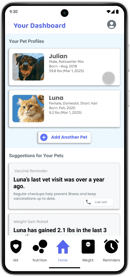
Simple Health Records Require Calling the Vet
Even basic information like vaccination dates and weight history aren't easily accessible when owners need them most.
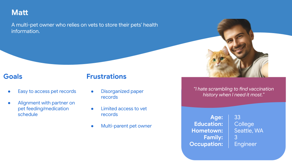
Personas: Meet The Users
Persona 1: Multi-Owner Households


Click to expand
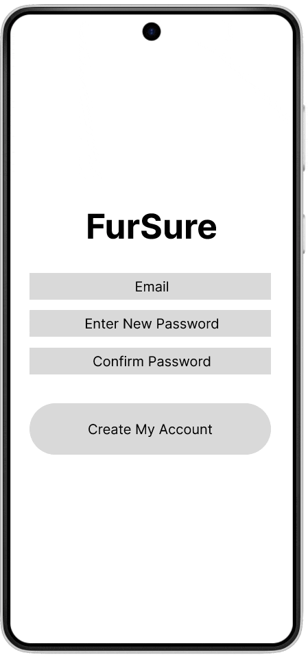
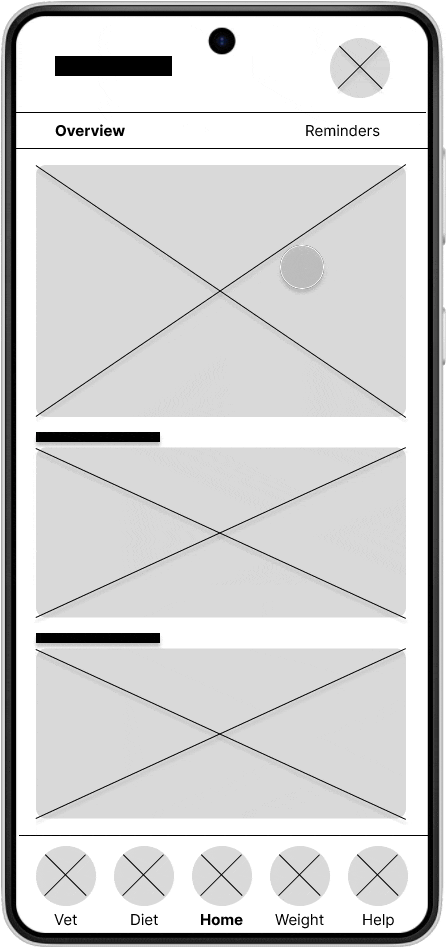
Lofi Prototypes
I started out with paper wireframes before creating lofi prototypes in Figma. Once the app was fully prototyped out, I began user testing.

Early testing felt too focused on the sign up process rather than the app experience.
So I scrapped this completely post-lofi.
Design Approach
Branding and Design
I crafted a cohesive design system that balances functionality with visual appeal, ensuring consistency across all touchpoints.
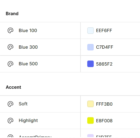
Color Palette
Reflects the caring nature of pet ownership while maintaining strong accessibility standards.
Typography
Built on an 8px grid system for consistent hierarchy and readability.

Iconography
Friendly, approachable icons while being immediately recognizable to pet owners.
Accessibility First
All color combinations meet WCAG AA contrast standards, and the design system prioritizes clear visual hierarchy to ensure the app is usable by pet owners of all abilities.
I focused on three key features that emerged from user research as the most critical to pet owners' daily routines and long-term engagement.
1. Reminders: Solving Multi-Owner Coordination
Shared pet care is surprisingly common between partners, roommates, and pet-sitters, but the tracking is usually fragmented.
"I would use this daily."
- User During Testing
Before
But once they found it, they loved it!
Reminders were a subpage at the top but missed
After
Reminders became a core page and feature
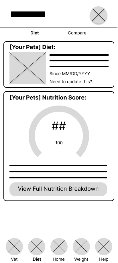
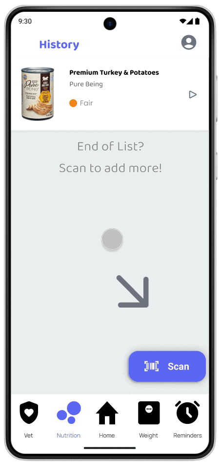
2. Nutrition: Food Transparency
Pet owners wanted a simple way to compare food options and understand what they were actually feeding their pets. The problem? They don't trust brand claims like "premium" or "grain-free."
My first design attempt included pre-filled food data, but it confused users. They couldn't tell if this was food already in their pet's profile or if they could change it.
Initial Wireframe
Users couldn't tell if this was their pet's current food or just examples.
Pre-filled data confused users
Final Design

A first-use starting screen that guides the user.
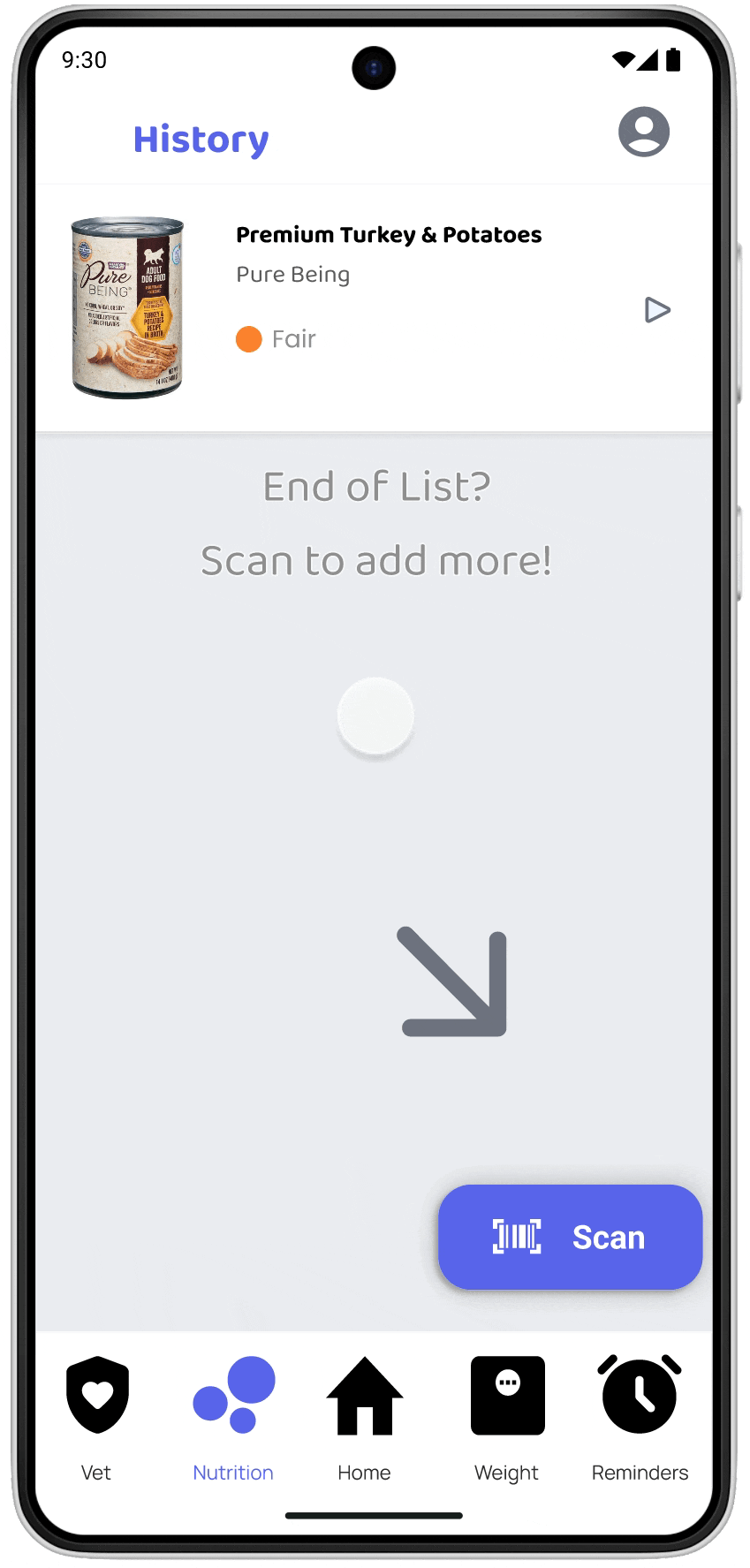
Scan feature encourages intentional interaction
Product Page Layout
While testing this new layout, two distinct user types emerged:
Quick Evaluators
Scanned for ratings, just wanted to know what product would be better-rated
Detail Readers
Wanted specific info but got overwhelmed by long scroll without filtering
The Result: The updated design (Option 2: Tabbed) serves both user types.
For detail readers, I created tabs.
For quick evaluators, I surfaced recommended alternatives at the bottom peaking above the fold so they could find better-rated options without reading details.
Long scroll overwhelmed users
Organized tabs serve both user types
3. Weight Tracking: Global Access
Weight tracking might seem niche, but several users (especially those with large breeds or senior pets) saw it as vital to monitoring health.
Then a UK-based tester pointed out something I'd completely missed: the input only allowed pounds, not kilograms.
"I wouldn't even know how to convert it."
- UK Tester


Lofi mockup "add weight"
Hifi mockup "add weight" (adjusted based on feedback)
Hifi layout design
Other Features Designed
The app includes additional features like vet record storage and vet details. These were designed with the same user-centered approach but not focused on in this case study to avoid overwhelming the core experience.
Focused on the three features above to demonstrate my design process and strategic thinking.
Acquisition VS. Retention
I realized something important: pet owners don't change food frequently once their pet is comfortable with a brand. The flagship feature that would attract users to download the app (nutrition scanning) wouldn't create lasting engagement.
This insight completely shifted my design priorities toward daily-use features that would create lasting engagement, not just solve one-time problems.
User Engagement Over Time
Initial Assumption
Focus on nutrition scanning as the flagship feature to attract downloads
Strategic Pivot
Prioritize daily reminders for long-term engagement and retention
What I Learned
Testing early and often changed everything. Features I assumed were "cool" turned out to be clutter, and removing them created a clearer experience.
"Before I do any purchasing decisions I would be pulling up this app."
— User during testing
More importantly, I learned to think beyond solving immediate problems to considering long-term engagement patterns. The most successful features weren't always the most innovative ones — they were the ones that fit naturally into users' daily routines.
This project taught me that effective UX requires balancing what attracts users with what actually keeps them coming back.