
CorrectPay UX Redesign
Streamlined the user experience post-login, helping users navigate services with clarity and ease. Based on experience from ~800 monthly software support tickets.
Personal project (exploratory/practice)
Project Overview
This project was driven by real-world insights from my time in a software support role.
Software Support Insights
of logged-in user flow
sparked IA overhaul conversations
Challenge
Account navigation poses challenges for users trying to access key services:
Hard to Start Services
Tasks like deposits and messaging are unclear.
Confusing Mobile CTA
Add New Individual mistaken for main action.
Too Many Clicks
Users click 3+ times just to begin.
Research & Data
In April and May of 2025, I personally handled 1,511 support tickets from users of the CorrectPay platform. From these, I compiled the 5 most frequent ticket types:
April & May, 2025: 5 Most Frequent Ticket Types (849 total tickets)
71% of these top 5 tickets relate directly to payment issues within the platform. The other 29% were unlisted or users not answering the phone after requesting a call.
User Journey & Solution
Users face a frustrating journey to complete basic tasks. What should be simple becomes a multi-step navigation maze.
Here's the step-by-step breakdown of the problematic user journey:

1. Account Home
2. My Individuals
3. My Blocked Individuals
4. Payment Methods
5. Transaction History
6. Account Information
7. Account Logout

• Add New Individual (prominent, confusing)
• Saved Individuals List
• Select Service buttons (hidden below fold)

• Start Deposit (Credit)
• Start Deposit (Bonding)
• Schedule Video Visit
• Phone Time
The Solution: Consolidated Dashboard
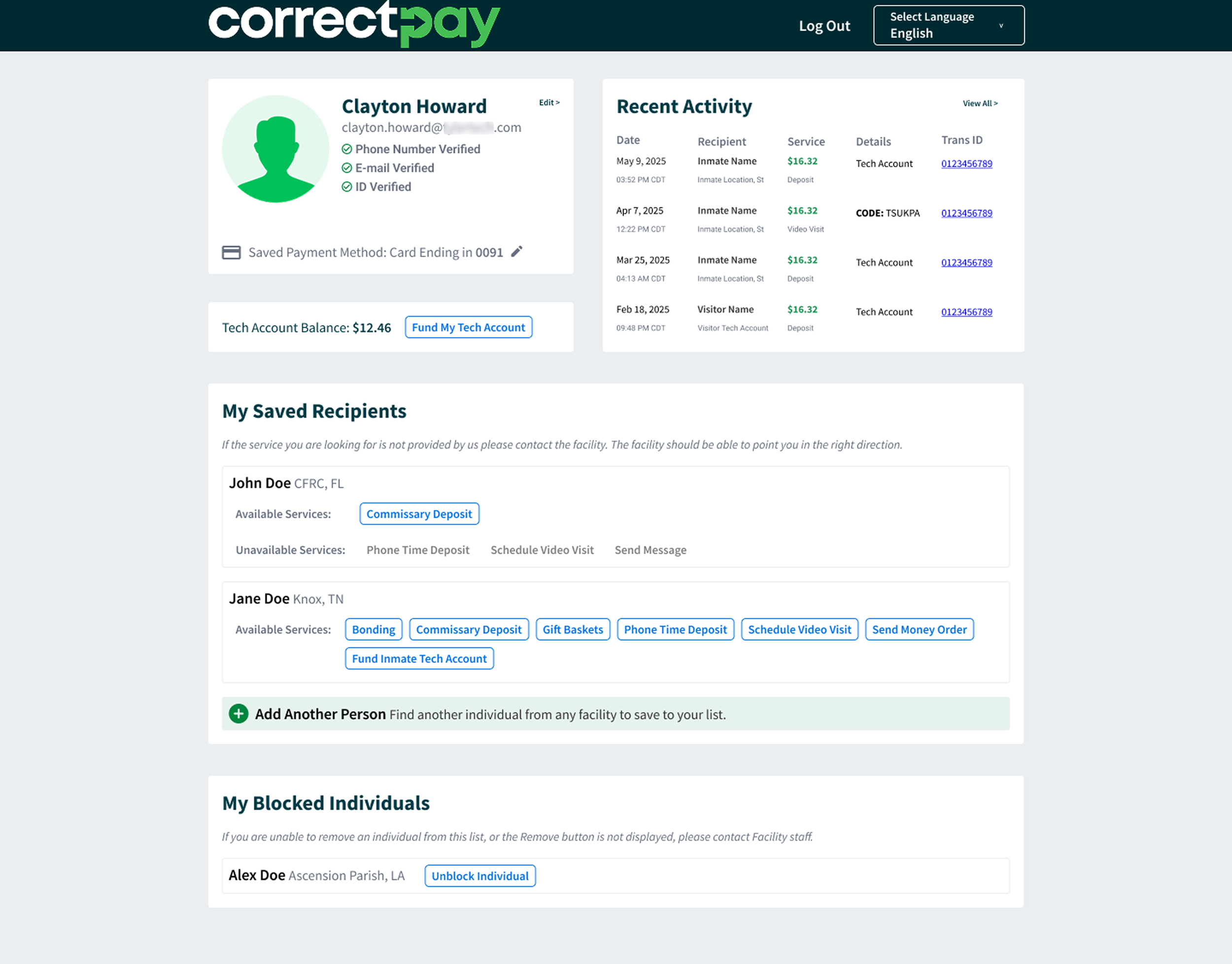
Users land directly on personalized dashboard
No hidden content or mobile scrolling issues
Services immediately visible and accessible
Primary actions obvious, secondary actions properly subordinated
Name, verification, payment method
Current balance + Fund button
Transaction table + "View All"
→ All services as direct buttons
→ Unavailable services (grayed out)
→ "Add Another Person" (subtle)
List + Unblock buttons
Impact & Validation
Real-World Impact
This redesign directly targets the user friction driving 71% of our most frequent support tickets. By consolidating the post-login experience into a single, clear page, users can immediately access services without navigating through multiple unclear screens.
Internal Validation
The solution gained immediate internal validation - my direct manager stated that the official redesign "should basically be exactly what you created," and the UX team praised the user-focused insights that informed the design decisions.